Notable User Interface Changes to Expect in macOS 26
macOS 26 Tahoe is a larger visual leap than any recent upgrade. Although we don’t yet recommend that everyone upgrade, we want to show you some of the user interface changes that will impact your everyday experience of using the Mac.
Liquid Glass Changes
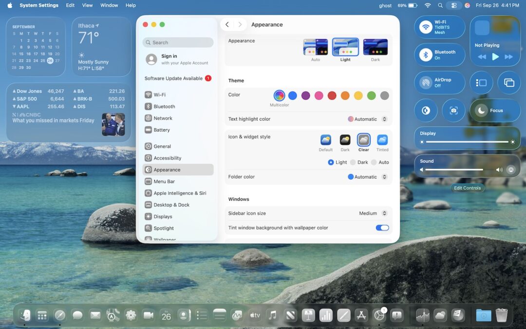
Many of these changes stem from Apple’s new Liquid Glass design language, which we’ve previously covered in more detail. Familiar macOS interface elements with a new Liquid Glass appearance include:
- Rounded corners: You may be surprised by the more rounded corners in many interface elements, including windows. There’s no option to adjust the corner radius.

- Menu bar: Tahoe’s menu bar is now transparent, allowing app windows or desktop wallpapers to show through, which can make it less visually prominent at the top of the screen. To make it opaque, go to System Settings > Accessibility > Display > Reduce Transparency. This setting also affects many other transparent interface elements.

- Icon style: Many developers are updating their icons to conform to Apple’s Liquid Glass guidelines. A more notable change is that users can now switch to dark mode icons, clear icons, or tinted icons in any color. Make these changes in System Settings > Appearance > Icon & Widget Style.

- Widget style: Desktop widgets are now mostly transparent when any window is open on the desktop, and they become solid only when the last window is closed or hidden. You can adjust this setting in System Settings > Desktop & Dock > Dim widgets on desktop. Widgets also adopt the same clear or tinted style used by icons.

- Customized folders: Folders start out blank, but you can Control-click one, choose Customize Folder, and pick an icon (monochrome) or emoji (colored) to brand the folder.

- Sidebars: Although they’re less transparent than other items, sidebars become subtly tinted based on what’s under them. That occasionally results in some awkward overlays, such as in System Settings > Wallpaper, where the thumbnails can scroll underneath the sidebar.

Safari
With Safari, Apple’s Liquid Glass interface causes the toolbar controls and the tab bar at the top to float over the page content underneath. On some sites, this can be distracting or make tab titles hard to read (below, top). If that bothers you, turning on System Settings > Accessibility > Display > Reduce Transparency separates the controls from the content more clearly, but also gives them a gray background (below, bottom).

Control Center
In Tahoe, Control Center not only receives a Liquid Glass makeover but also gains notable new features. Similar to iOS and iPadOS, you can now fully customize the buttons, sliders, and other interface shortcuts in Control Center, removing those you don’t need and adding others. To get started with personalization, click Edit Controls at the bottom of Control Center.

The selection of commands is impressive enough on its own, but Apple also promises that independent developers will be able to offer controls for their apps. Clicking the + button in the menu bar provides the equivalent of additional Control Center pages from iOS: another menu bar icon that displays a different set of Control Center items. You can have as many of these extra Control Center pages as you want.
Lastly, note that you can add many items from Control Center directly to the menu bar, where they can function as toggles or quick access shortcuts.
Spotlight
Apple revamped Spotlight in Tahoe, adjusting its interface (yes, it’s transparent by default, too) and introducing clipboard history. When you activate Spotlight with Command-Space and move the pointer, four buttons appear to filter your search by apps, files, shortcut actions, and clipboard history—Command-1 through 4 serve the same purpose.

Previously, Spotlight separated different result types vertically; now you can click buttons just below the search box to filter results by category. Spotlight also remembers past searches, allowing you to use the arrow keys to browse backward and forward through your search history.
Spotlight’s new Apps view, which gets its own icon on the Dock, also replaces the longstanding but little-used Launchpad. If you want a full-screen grid of app icons, similar to Launchpad, consider Launchie, AppHub, or AppGrid Launcher.

Terminal
Although many people never open the Terminal app, which gives access to the Unix command line hidden in macOS, Apple has finally updated it to allow for more customization. Fortunately, Terminal still features completely opaque windows—transparency won’t make reading command-line output any easier. Each profile offers various customization options beyond appearance, so those who frequently use Terminal can tailor it to their preferences.

While we don’t want to downplay the impact these visual changes may have on your Mac experience, we’ve also found they’re easy to get used to or turn off. After using Tahoe for a few weeks, most of these changes will become the new normal. Apple will undoubtedly continue to polish Liquid Glass over the next year, refining its smoothness and eliminating awkward bits.
(Featured image by Apple)
Social Media: From transparent menu bars to customized folders, macOS 26 Tahoe introduces the most significant visual update in years. Discover the key interface changes that will influence your daily Mac use… and which you can turn off.